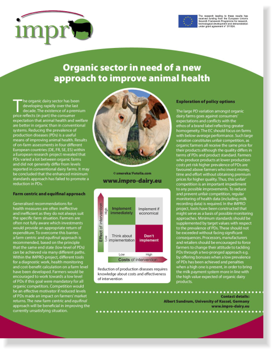
The IMPRO logo was designed to underline the project’s general ideas, creating a positive and lasting impression. It contributes to an effective, consistent and correct communication of IMPRO’s main concepts and ideas.

The core element of the logo is the acronym of the project, related to the first letters of the words impact, practices and organic and the main purpose of the project: improvement. A cow, the target species of the project, is placed in the centre of a circle, standing for the o in IMPRO. The dot on the i and the cow are connected with an arch, representing the idea of “bridging the gap” between research and practice, an underlying concept of IMPRO.
The IMPRO colours are green, magenta, and black. The green colour represents the concept of nature and is related to organic agriculture. Magenta represents the aspect of energy and tension and the use of black colour reinforces the concepts of functionality.


